A Q&A with Nina Chakrabarti on illustrating history
by Nina Chakrabarti, Illustrator
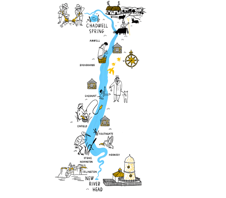
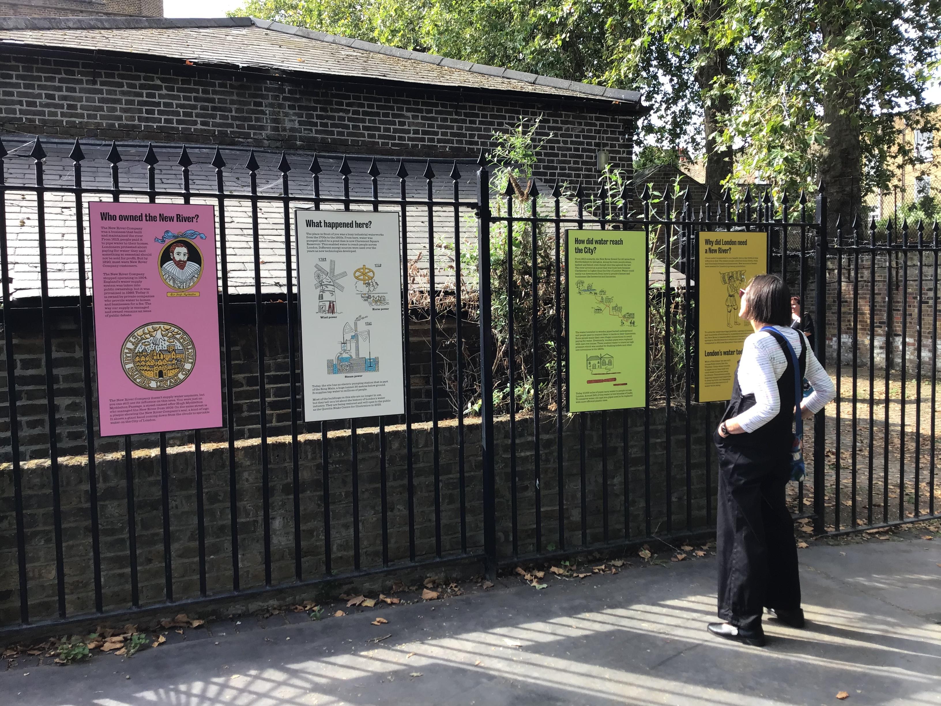
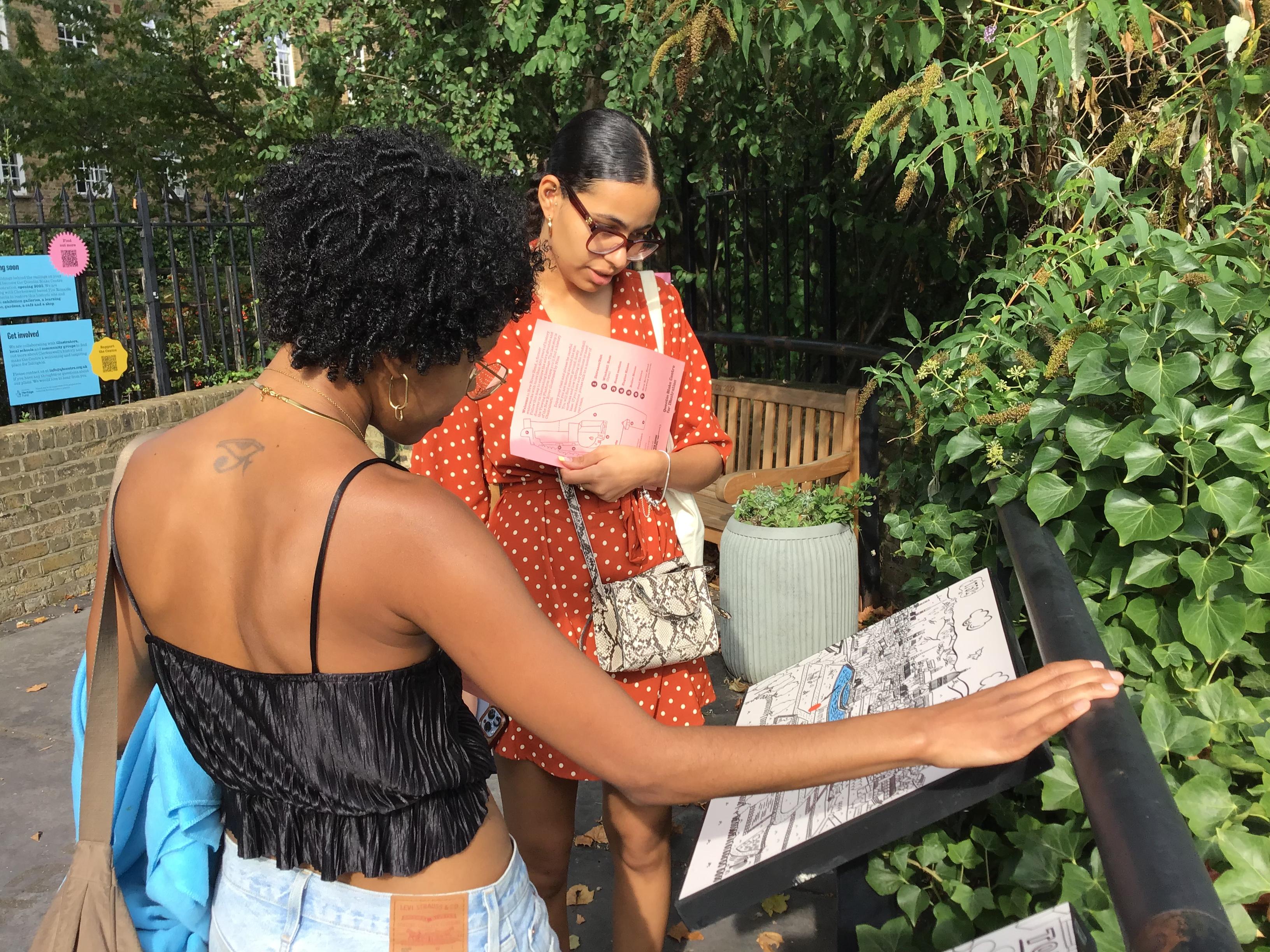
Our future home at New River Head has been part of London’s clean water supply since the 1600s. Illustrator Nina Chakrabarti has captured the site's 400-year history in a series of new illustrations for our Viewing Platform, – a little outdoor space open on weekends.
We spoke to Nina about her research process and the role that illustration can play in telling the stories of the past.

What type of research did you need to do to create the illustrations?
When drawing historical buildings, people and scenes it’s important to get the details right even if you’re illustrating them in a simple or stylised way. The Quentin Blake Centre for Illustration team were a huge help in that they provided me with bulging folders of historical detail and picture references from the New River Head archives. I also visited the site in person which is essential in a project such as this one. It’s vital to get a sense of place and to be able to contextualise the information you’ve been given.
Did you learn anything new or interesting about New River Head during your research?
I did not know that a large section of the New River remains part of London’s water infrastructure today.
I also learnt that Londoners use double the water per person compared to 25 years ago. The city overall uses 2.6 billion litres of water a day which is quite mind-boggling.

Why do you think illustration is important when sharing history?
Illustration can bring history to life. In the past, it gave people a deeper understanding of place, history and culture. Today it can convey things that photography or film cannot capture. It can also make information easier to understand.

Were there any challenges you encountered when working on these illustrations?
There were small hiccups, for example I got so absorbed in drawing the Latin inscription for the New River Head seal that I omitted a letter, which meant the inscription no longer made sense.
I also spent ages drawing a water carrier delivering his container of water to Londoners and was pretty pleased with it only to find out that the picture reference was depicting a Dutch water carrier and not one from London. Everything about the drawing was historically incorrect and had to be changed!
I wouldn’t call these challenges. It’s part of the job.
What was your favourite part of illustrating the panels?
It was like being invited to a secret bit of London; somewhere interesting that I hadn’t known about or been to before.
How was illustrating for large-scale outdoor panels different from other projects you’ve worked on in the past?
I normally work on smaller projects, like books, which take months to create. This was a collaborative project with the Quentin Blake Centre and the designer so it was interesting seeing the drawings evolve and take shape alongside the text.
